 |
| Design 1 |
 |
| What design 1 looked like on the top |
With any design, I generally print the pdf page of the design because it helps me pick and organize my thread colors. It also helps me place my design in the hoop. I also do a stitch out or sample of the design as a test.
Often, I complete a number of stitch outs because I might see ways to change the design so it stitches more cleanly or I might determine to change some thread colors so the design shows better. I like to use the same fabric that I will be stitching the design on so I can see if I need to make needle or thread changes.
 |
| White stitching showed up better |
 |
| More sample designs. . .this wasn't it |
Was I ever disappointed! That rich magenta, while a 70s color, sure didn't work for this piece. Those wonderful notes were lost from a distance. The words looked wonky.
What to do? I played with the letters in the word. I spread them apart. I changed the angle. After each update, I printed a paper copy of the design and put it on the top to see what I thought.
From my thread stash, I pulled out a gold, a black, a silver and a white thread. I found the gold fought with the gold in the bell bottoms. The silver fought with the gold. The black was too dark and stark. The white was right! No way would I have thought it would be the choice; but, my friend suggested it!
 |
| Embroidering the letters separately |
Funny, I was thinking of embroidering the letters separately; but, was considering painting the background. Although, I could fit all the letters in the hoop for one stitch out, I didn't have enough dark jean fabric for the stitch out!
I laid the fabric in place and after a section was stitched, I laid more fabric on the hoop and folded the previous fabric out of the way. It took a little fudging to be sure that there was plenty of fabric between the letters.
 |
| Letters cut and ready for placement |
The darkest jean fabric came from the back of the recycled jeans. The next darkest came from a side of the jeans and the upper part of one front. I needed just a bit more fabric, so I used the fabric that was under the front pocket!
I liked the contrast between the stitching and the dark jean fabric.
Soon, it was time to cut out the letters. I chalked the first one to be sure that my printed pattern had enough space. It did! It was a bit "scary" to cut because as we know, you can trim more; but, you can't put it back on!
 |
| Letters appliquéd into place |
 |
| Black notes weren't enough contrast |
I liked the idea of notes so much that I printed some on paper and played with where those notes might want to call home.
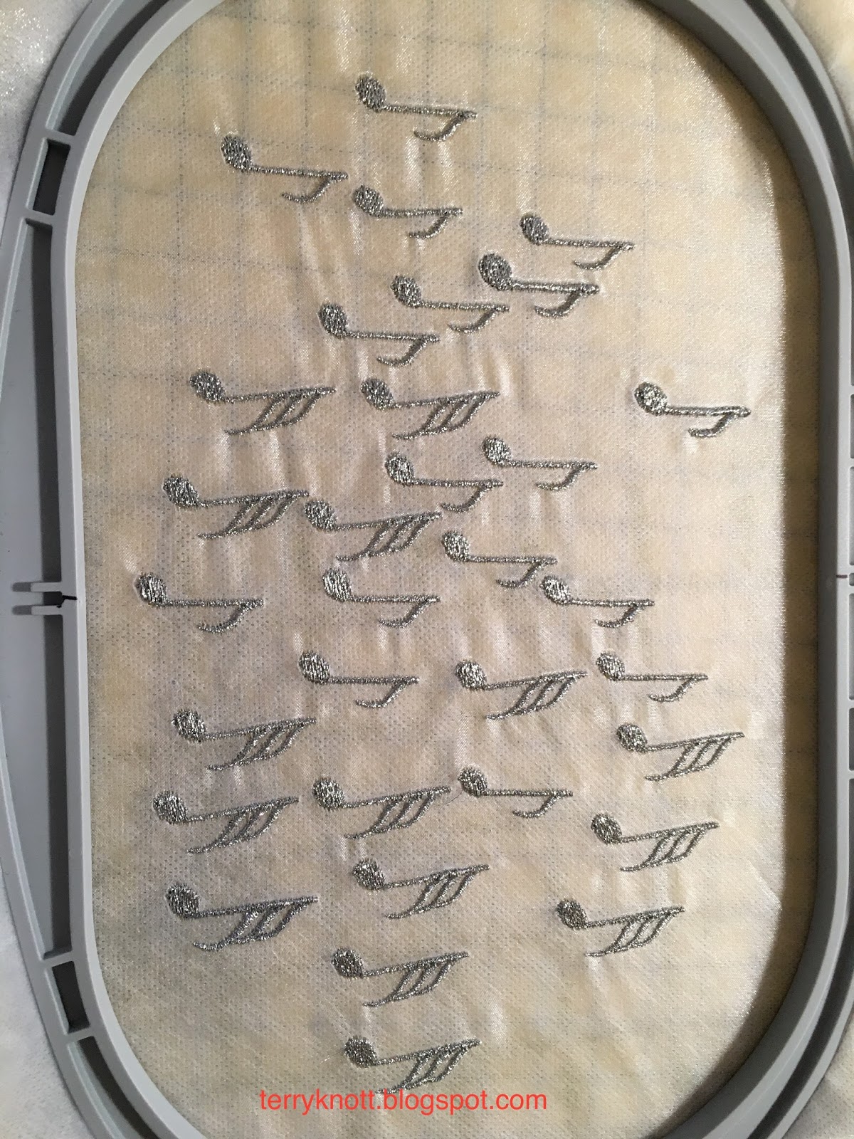 |
| Embroidered silver metallic thread notes |
I embroidered some on organza. I used a wash away as well as a tear away stabilizer. I've used this black thread in the past; but, for some reason the thread wanted to shred. I put in a new needle; I put in a larger needle. . .I still had the same results which made stitching these take longer than necessary!
What I learned from this first attempt was that I should not have used the tear away stabilizer as it showed a bit from the back. The black thread that I just knew would show up on the top, didn't.
I got out the Fil-tec product silver metallic thread that I purchased at a quilt show. I filled two bobbins. One with a silver gray polyester thread and one with the silver metallic thread. I threaded the machine with the metallic thread with the polyester thread in the bobbin. I hooped the wash away stabilizer and the organza together. I slowed the machine to stitch at the slowest speed possible. I inserted a new 90 top stitch needle. I took a deep breath. I pushed start. I watched the machine stitch the first note perfectly. I looked at the back. I looked at the front. The polyester thread took away some of the sheen of the metallic. I changed the bobbin to the metallic thread. I took another deep breath. I pushed start. I watched a beautifully formed note appear and then another. In the three hours it took to stitch 36 notes, I had three glitches where the thread jammed.
I loved the metallic notes. They looked great against the denim background. My friend suggested that after I had trimmed the organza to use a wood burning tool to remove the remaining organza. I was dubious; but, I tried it. I purchased a wood burning tool at Joann Fabrics with a 40% off coupon. It worked great! The notes looked so good, that I decided that I would add them after the quilting phase. I even decided that the notes would be three dimensional.
Come back on Sunday to see more progress on this project!
No comments:
Post a Comment